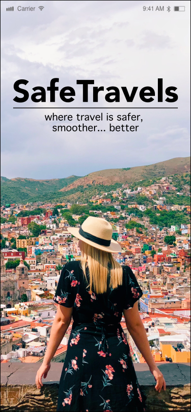
SafeTravels
Designed and wireframed a mobile app concept for solo travelers to explore safely by mapping out nearby crime and safety risks.
- role
- Interaction designer (student)
- deliverables
- Journey map · Moodboards · Style guides · Wireframes · Hi-fi screens
- tools
- Adobe InDesign · Figma
Research
Created user profiles and targeted female solo travelers, designing intentional features to enhance user safety.
Visual identity
After user profiling, moodboards and style guides established typography, color, and tone to align with target user.
End-to-end flows
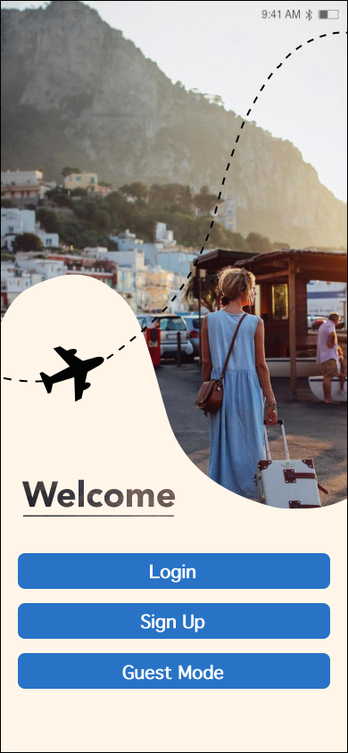
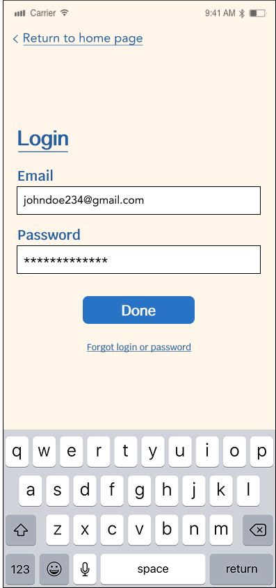
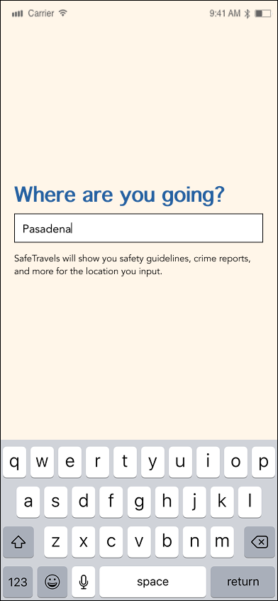
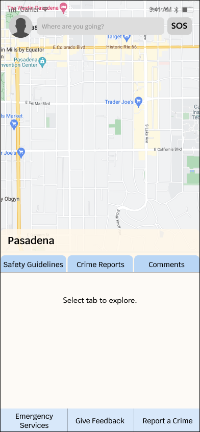
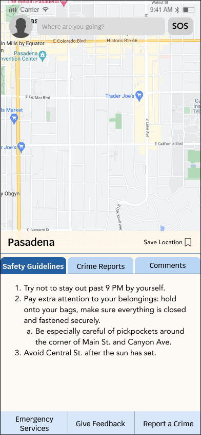
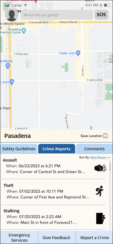
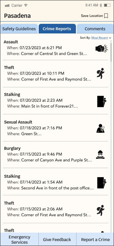
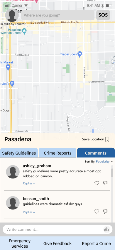
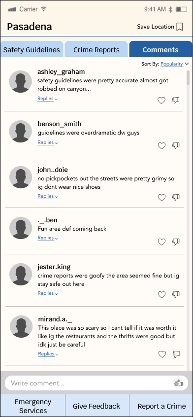
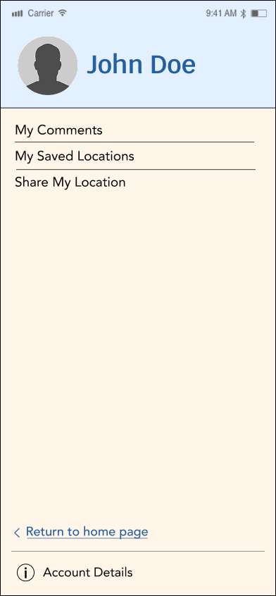
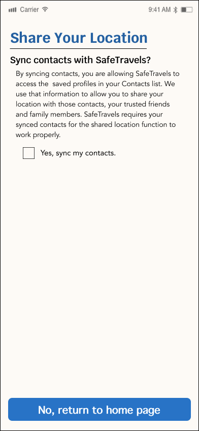
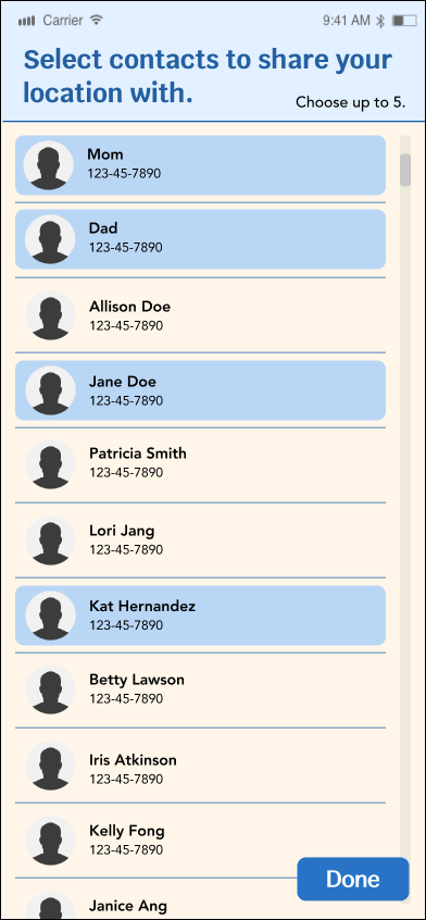
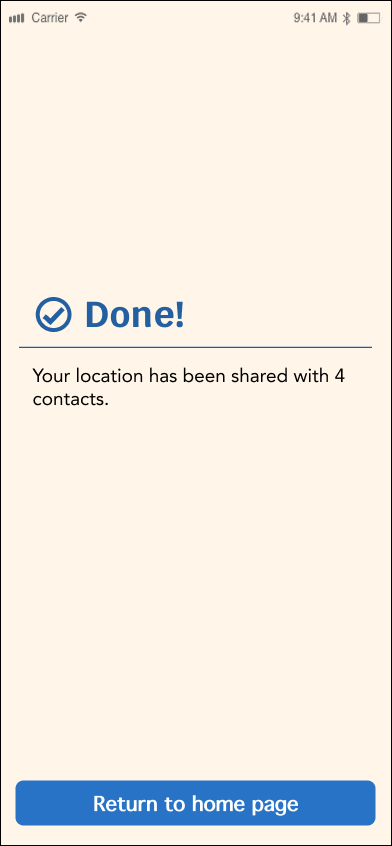
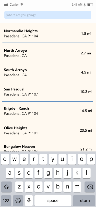
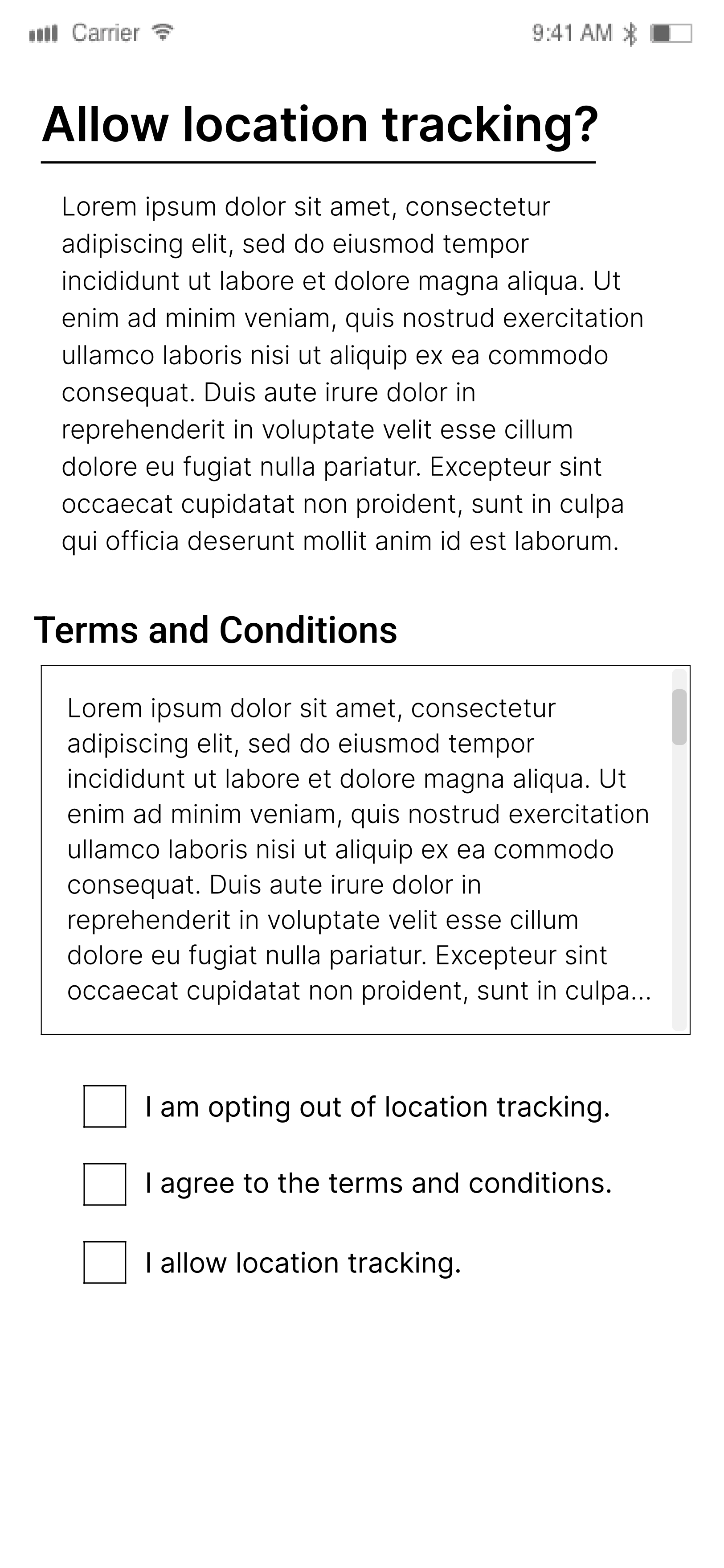
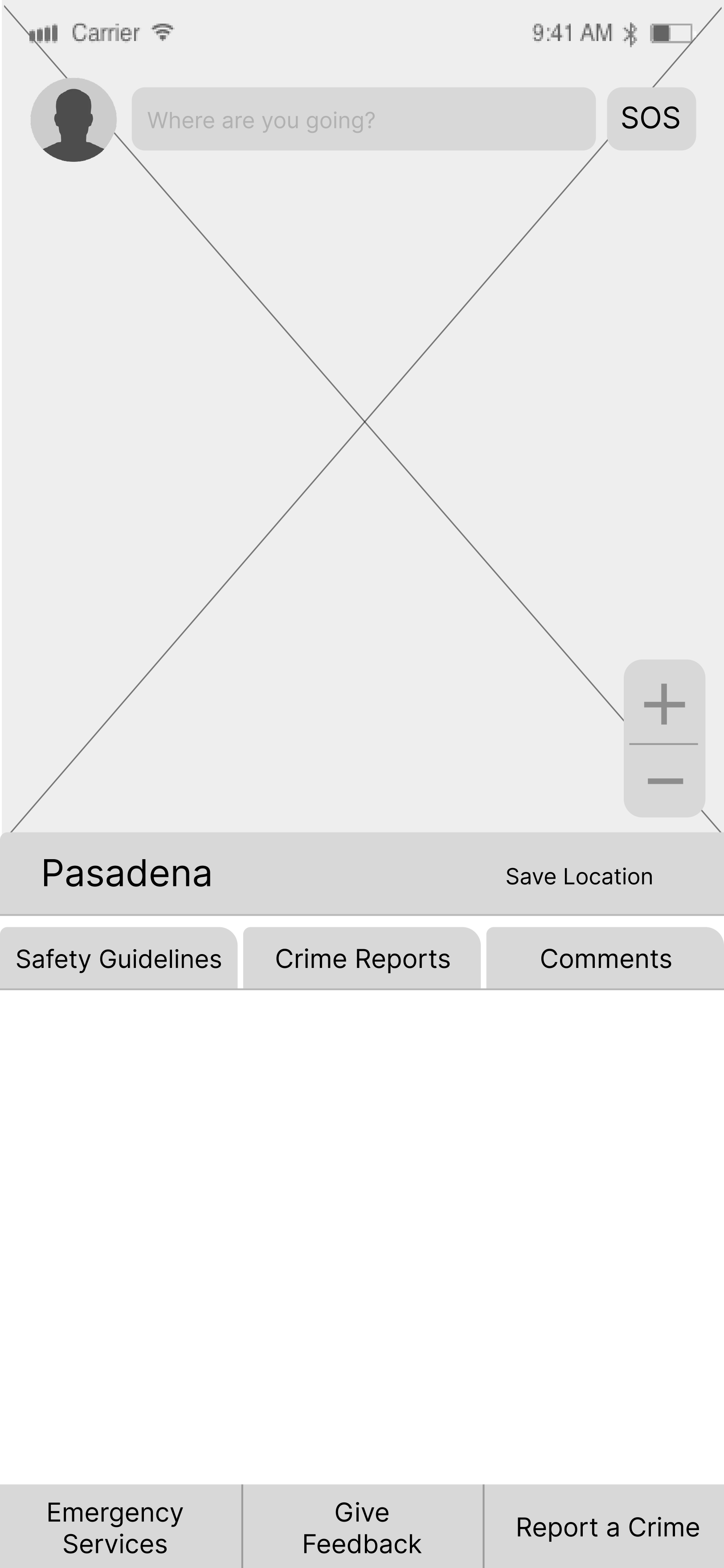
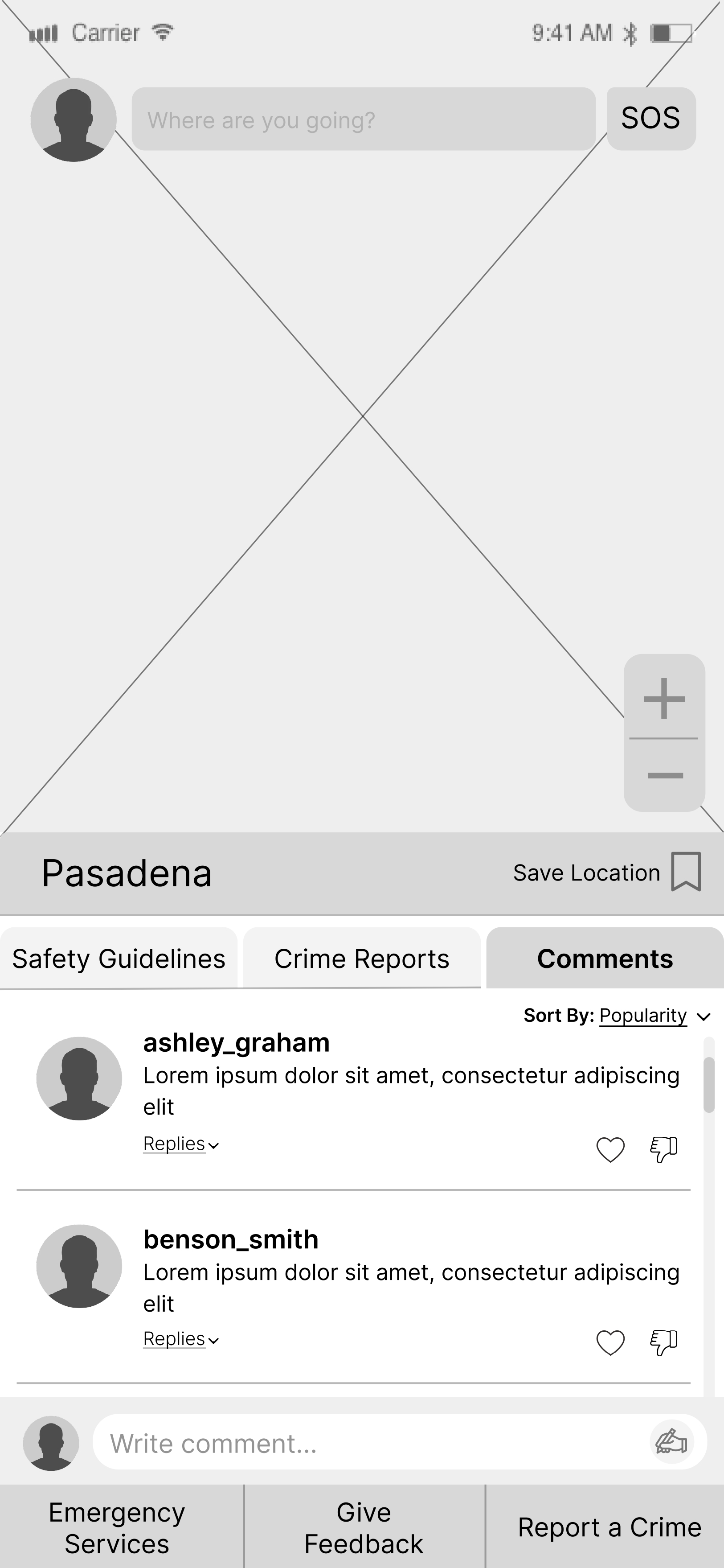
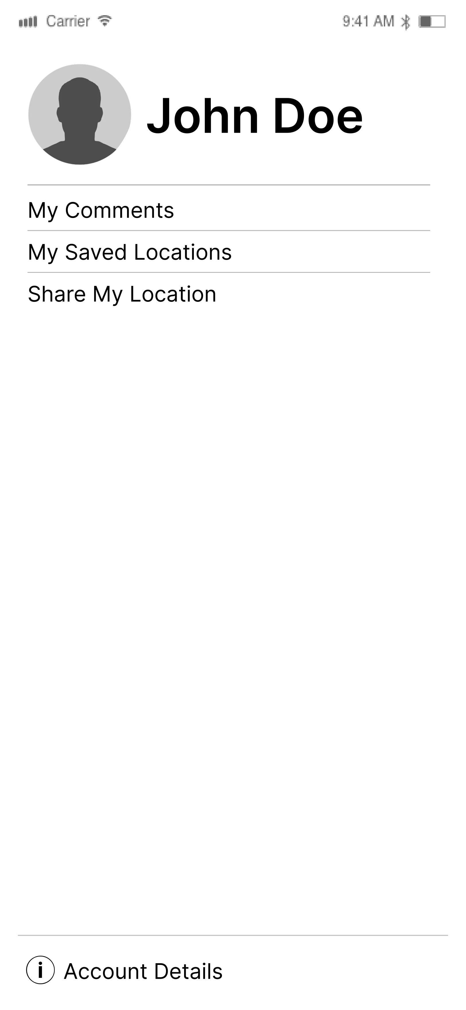
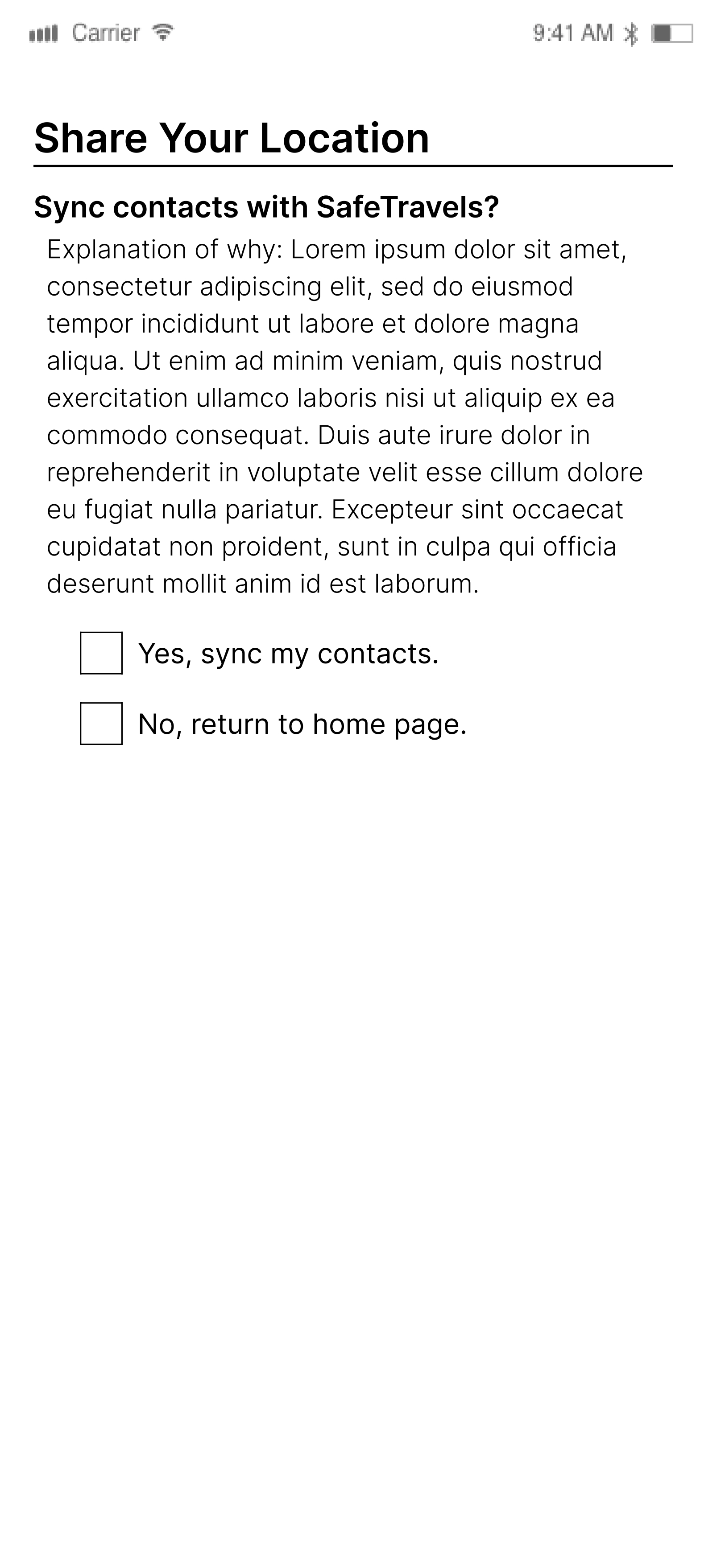
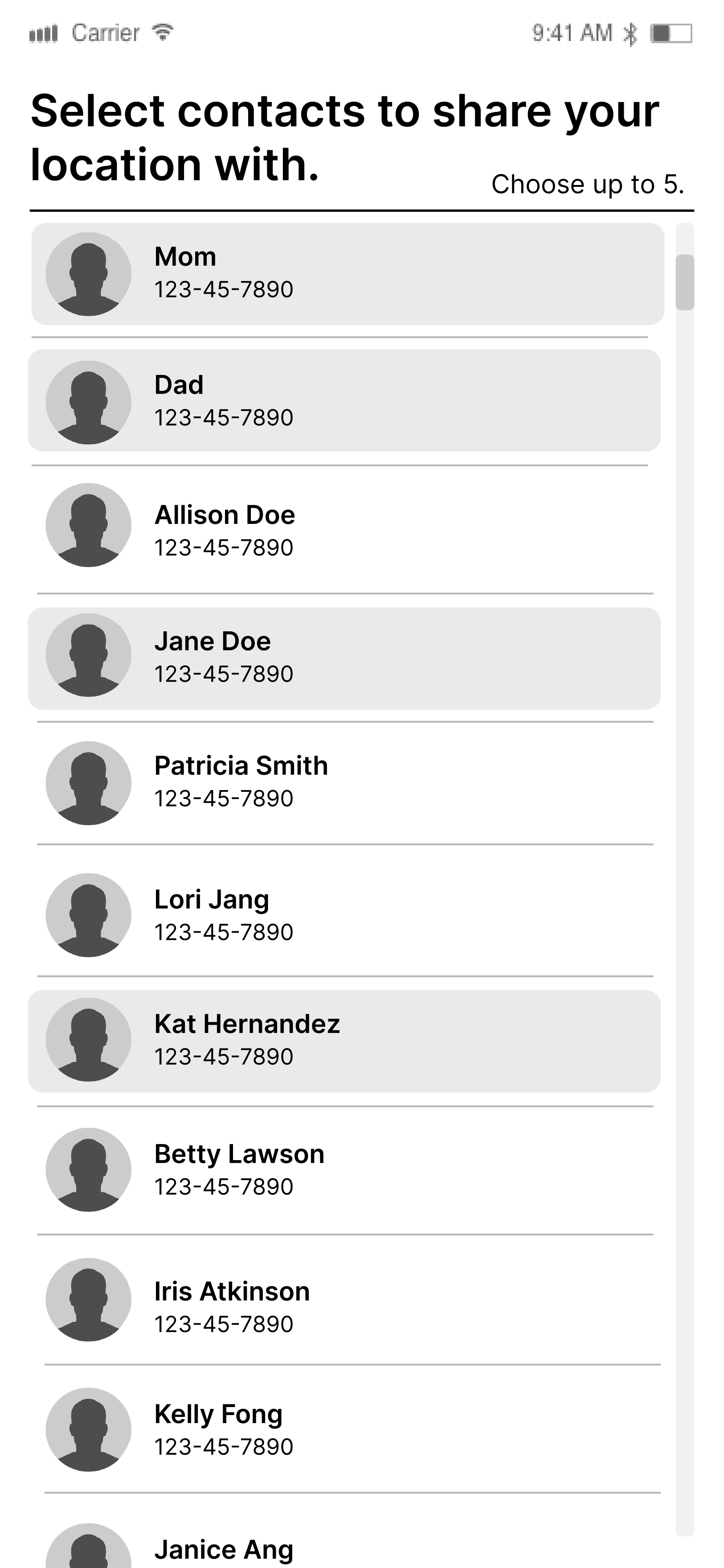
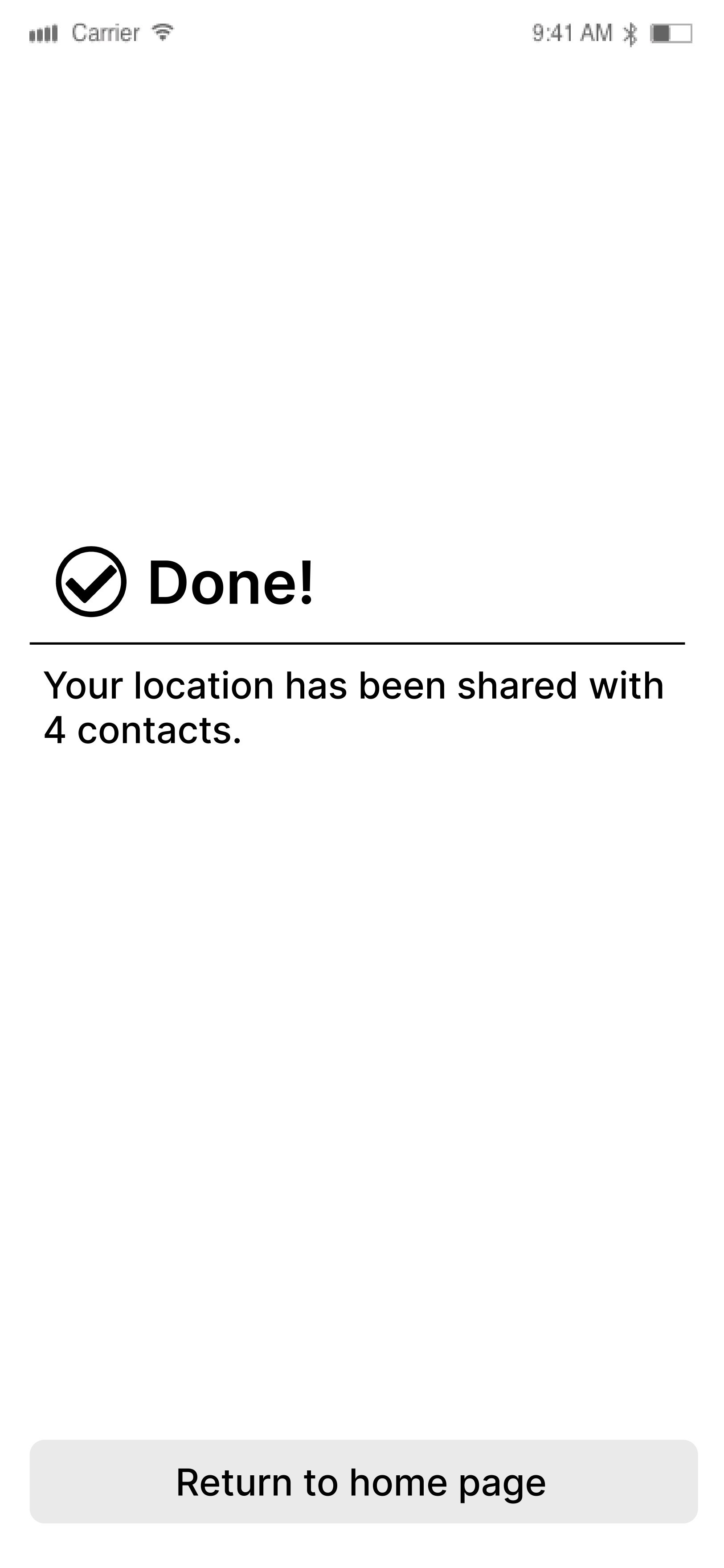
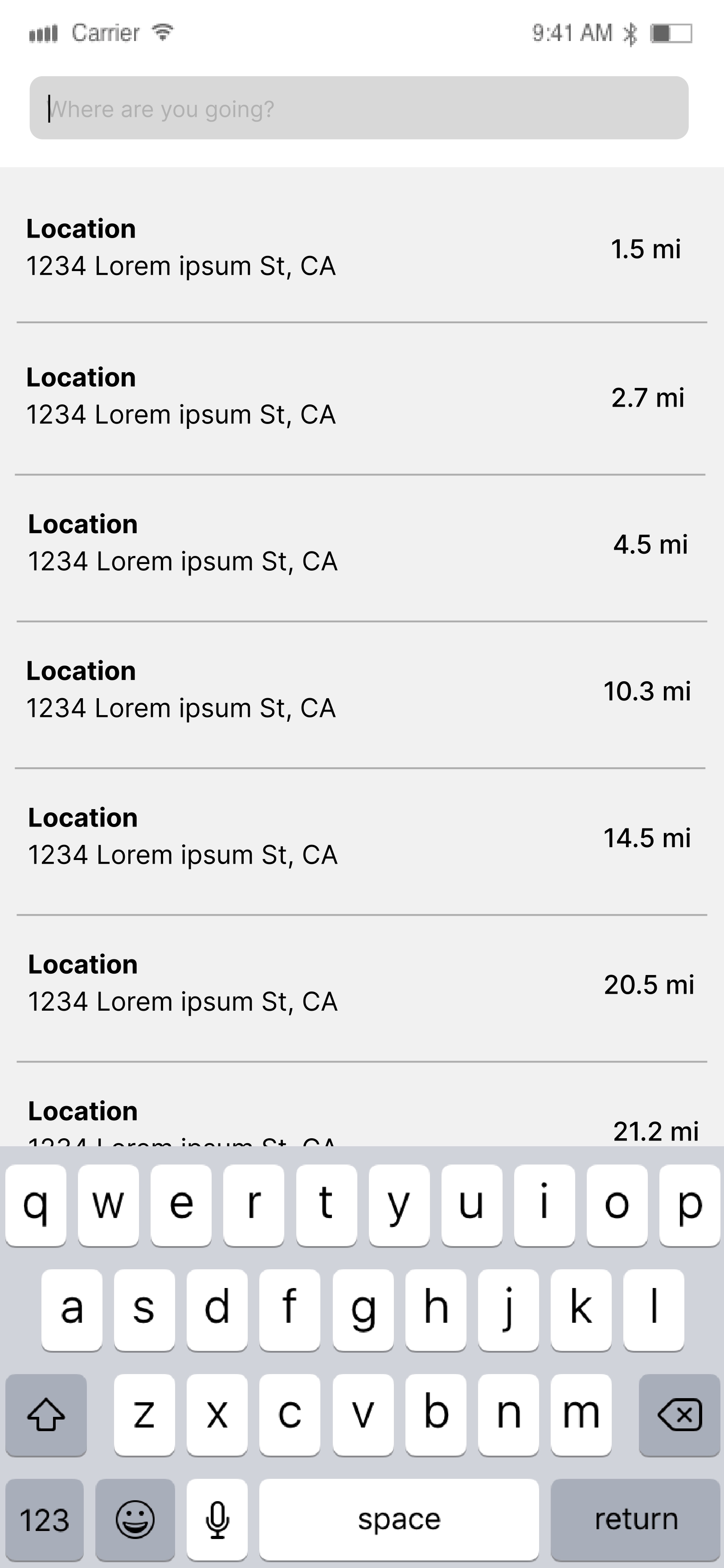
Low-fi wireframes through full-color hi-fi screens for onboarding, home, crime reports, comments, profile, and location sharing.
The task
Safety without sacrificing agency
As the final project for my Interaction Design course, I had to create and wireframe an app concept. Thus, SafeTravels was born as an app for solo travelers who want the agency to explore freely while still feeling safe and vigilant about nearby violence or crime.
Step 1 — Mapping the solo traveler experience
Mapped the user interactions and flows through
-
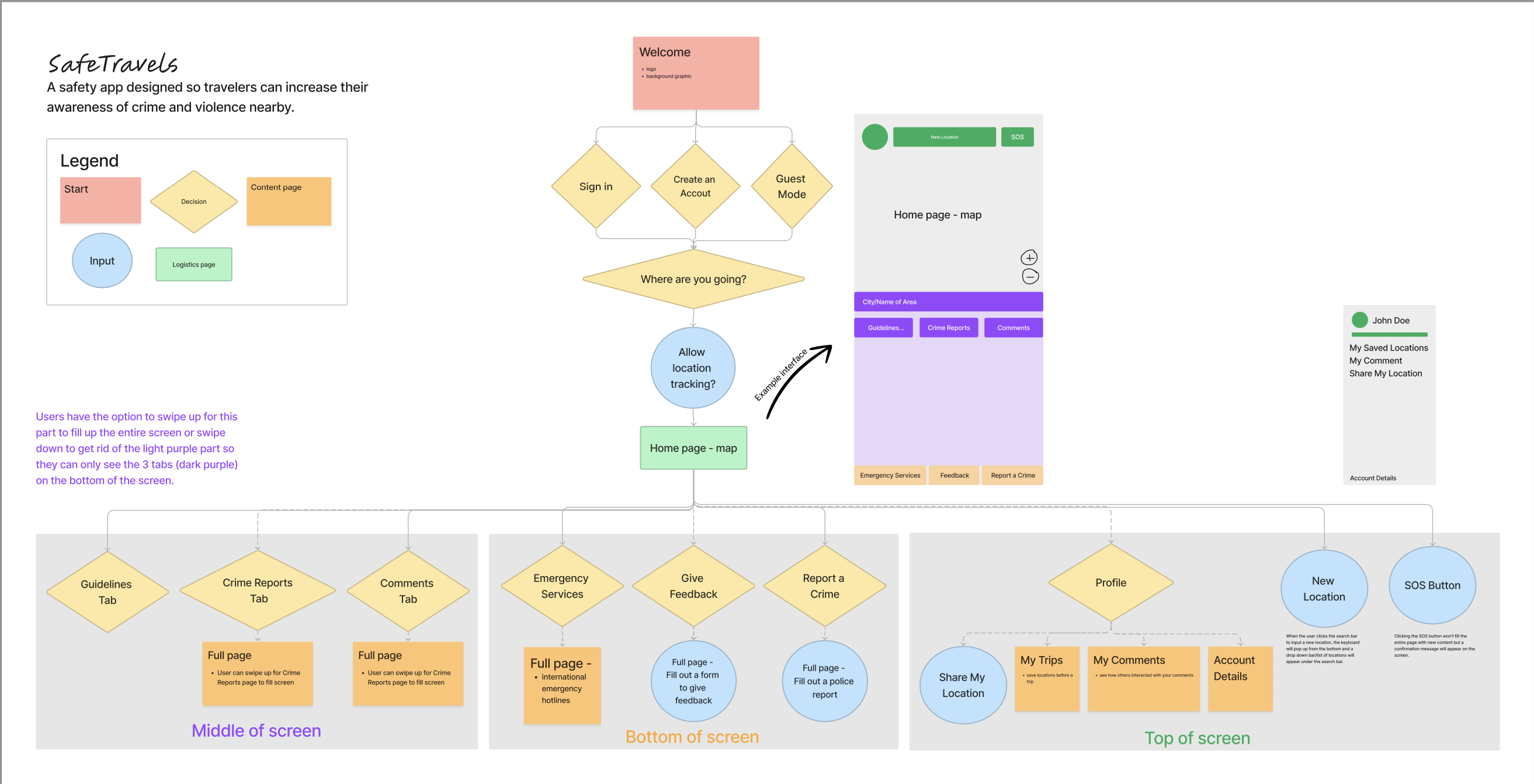
Customer journey map
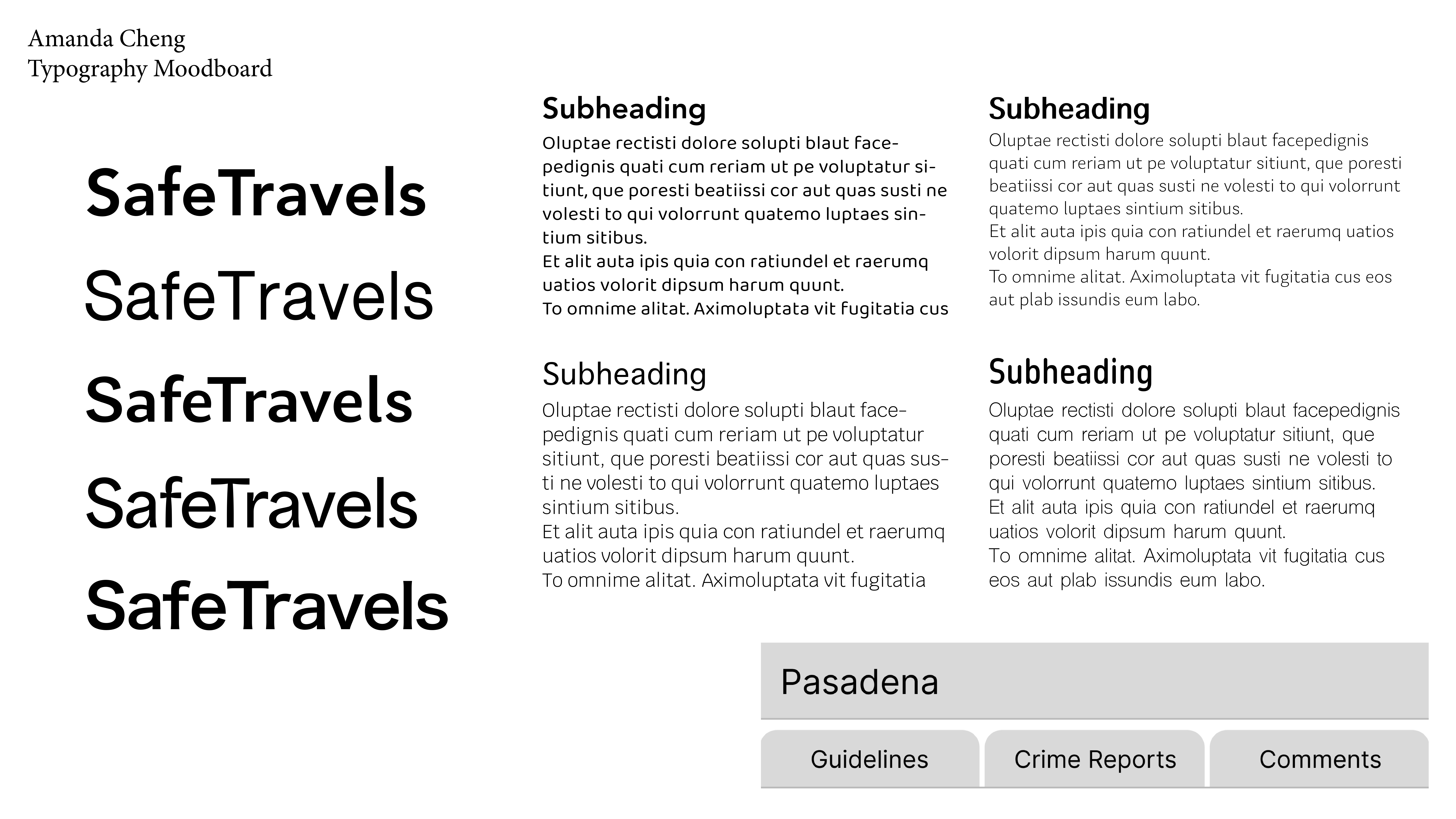
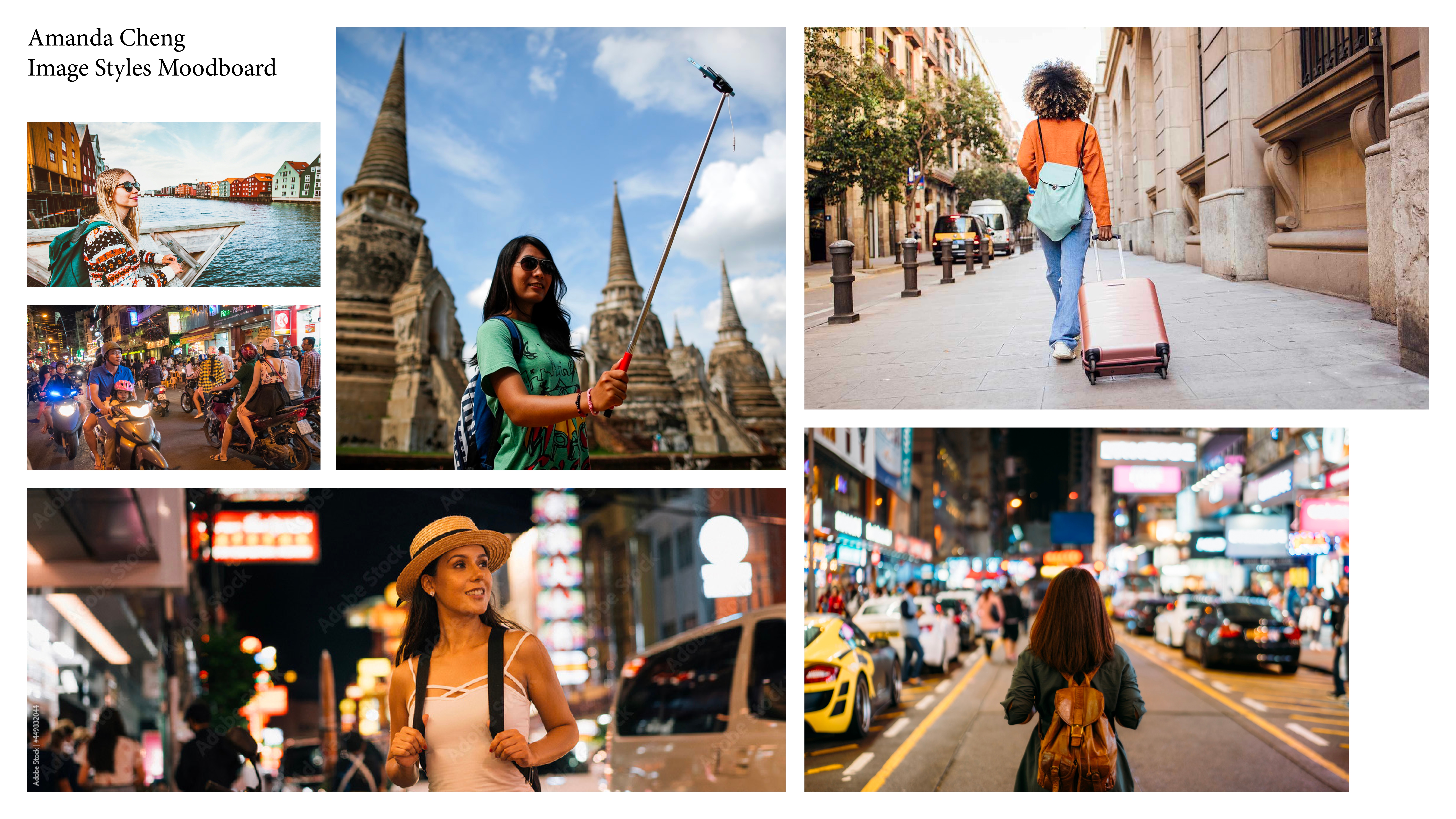
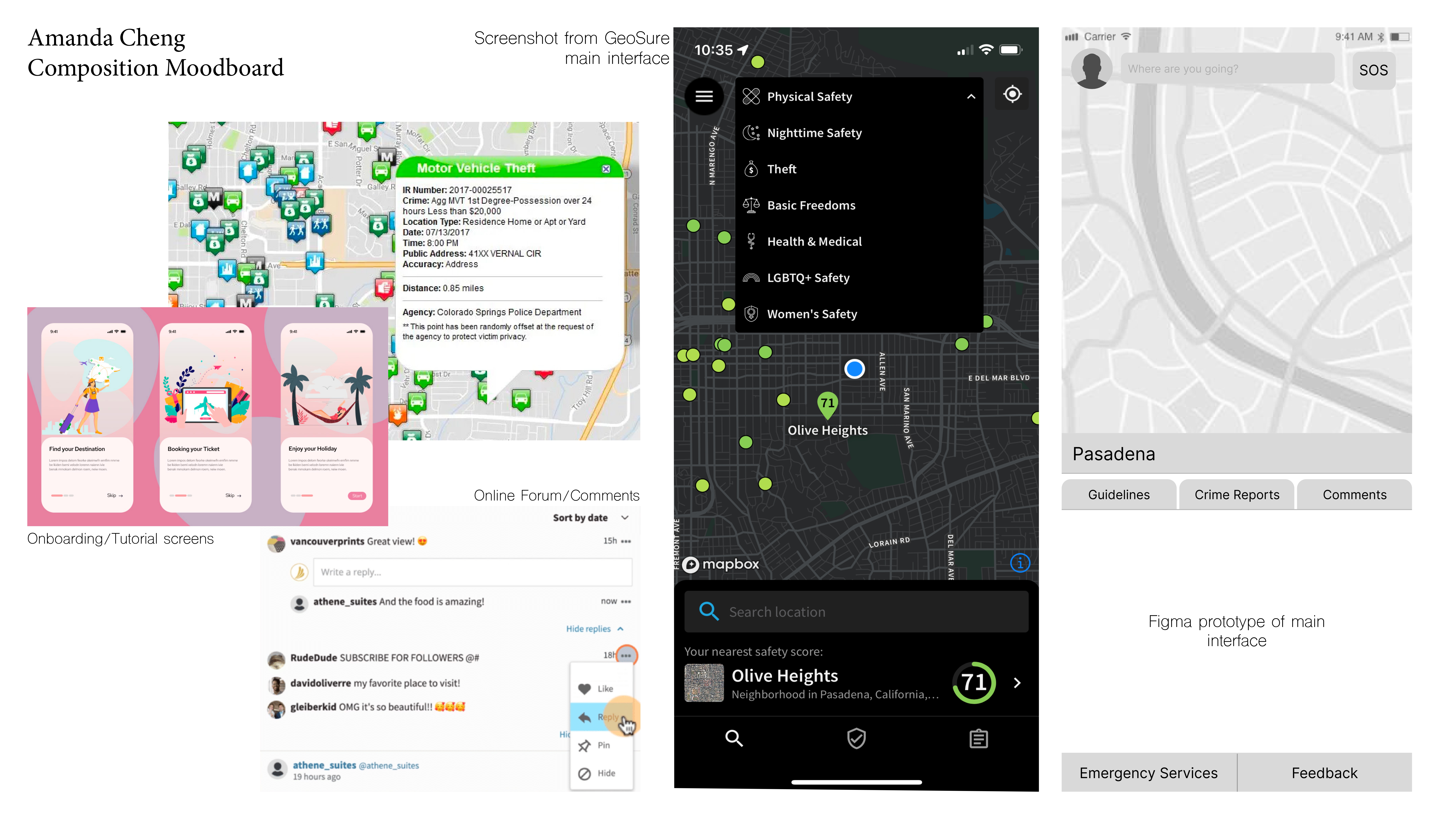
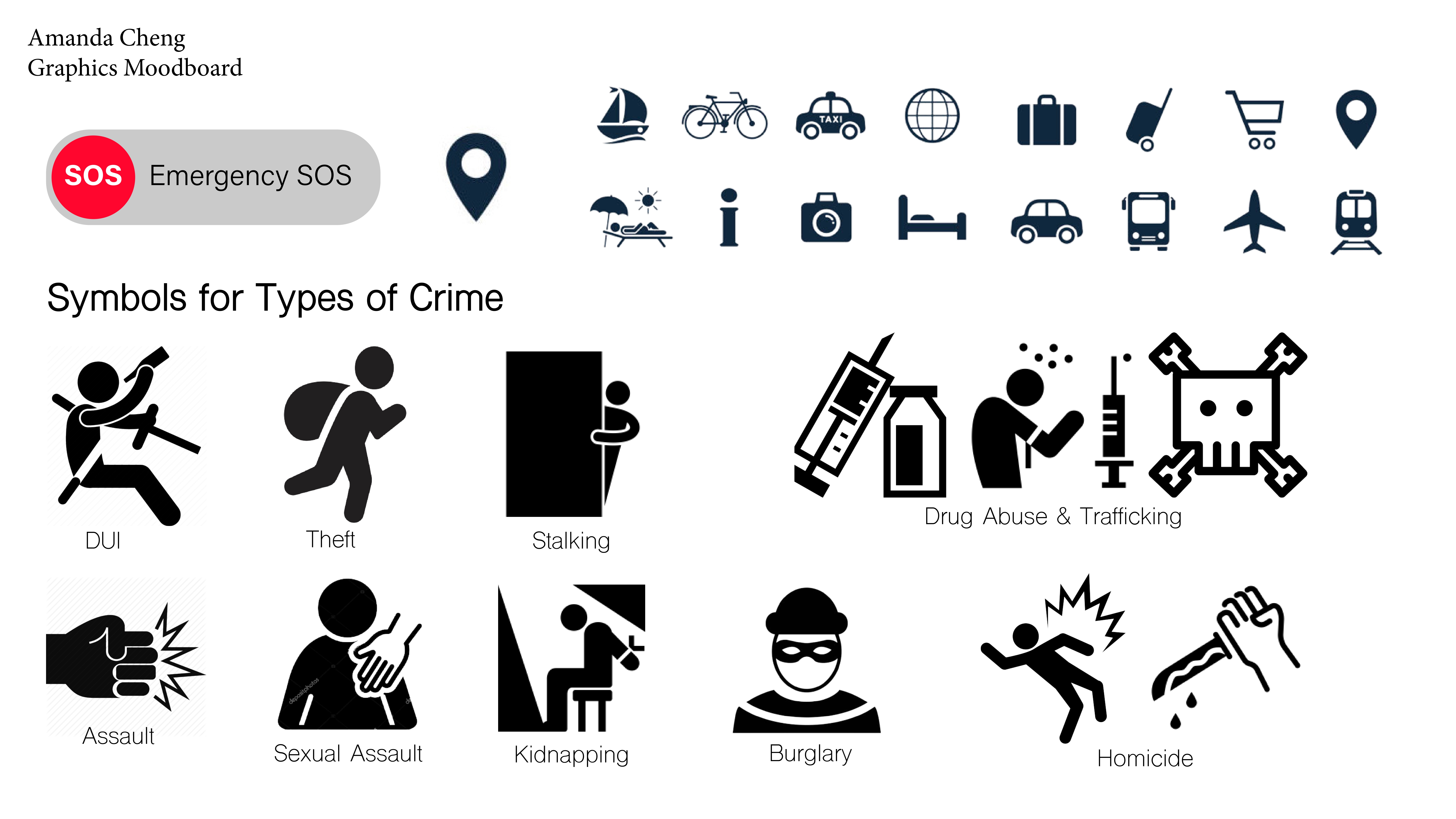
Step 2 — Exploring tone and visual direction
Explored typography, visual assets, and overall tone—cycling through board pages to compare directions before committing to a system.
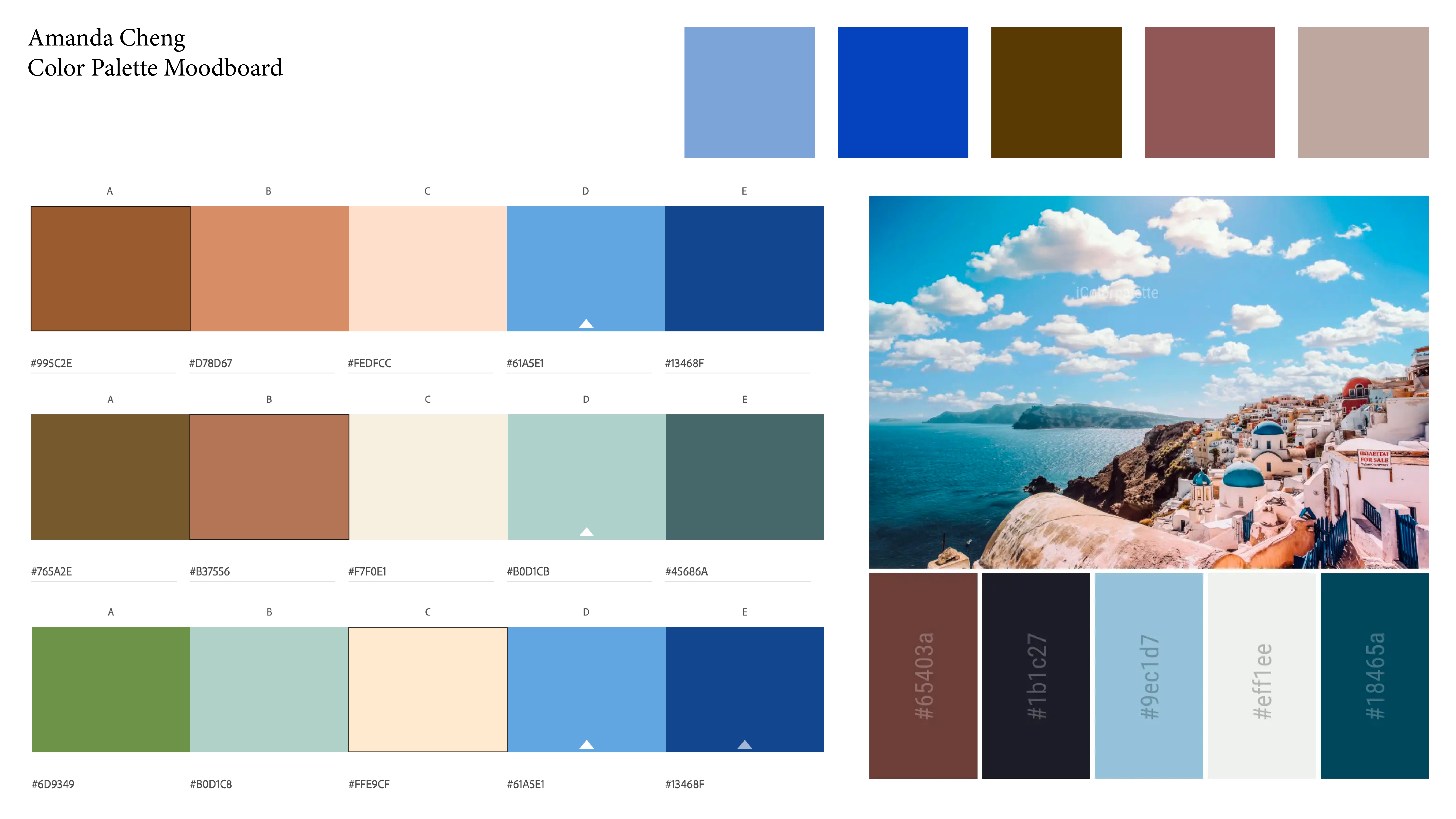
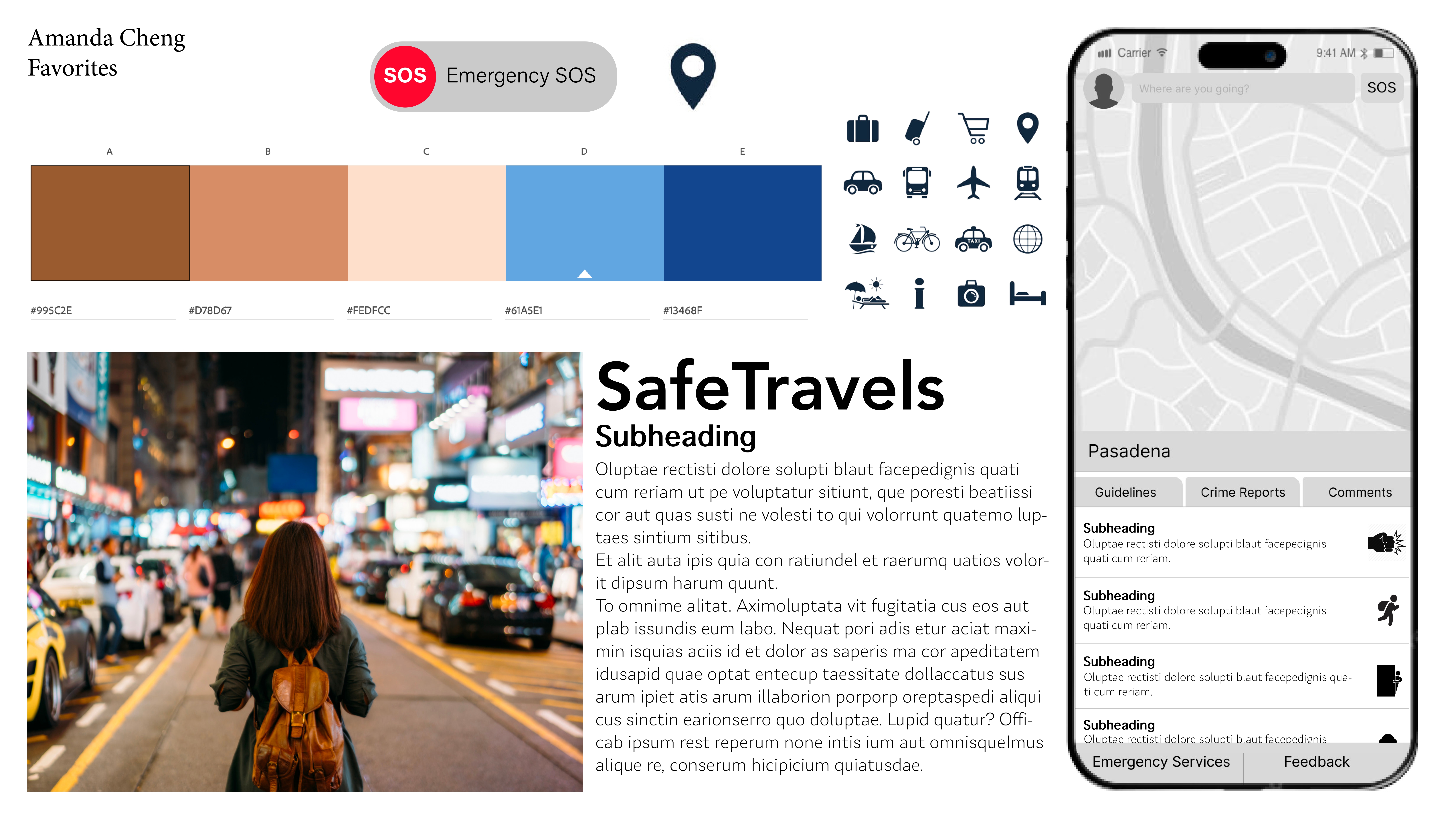
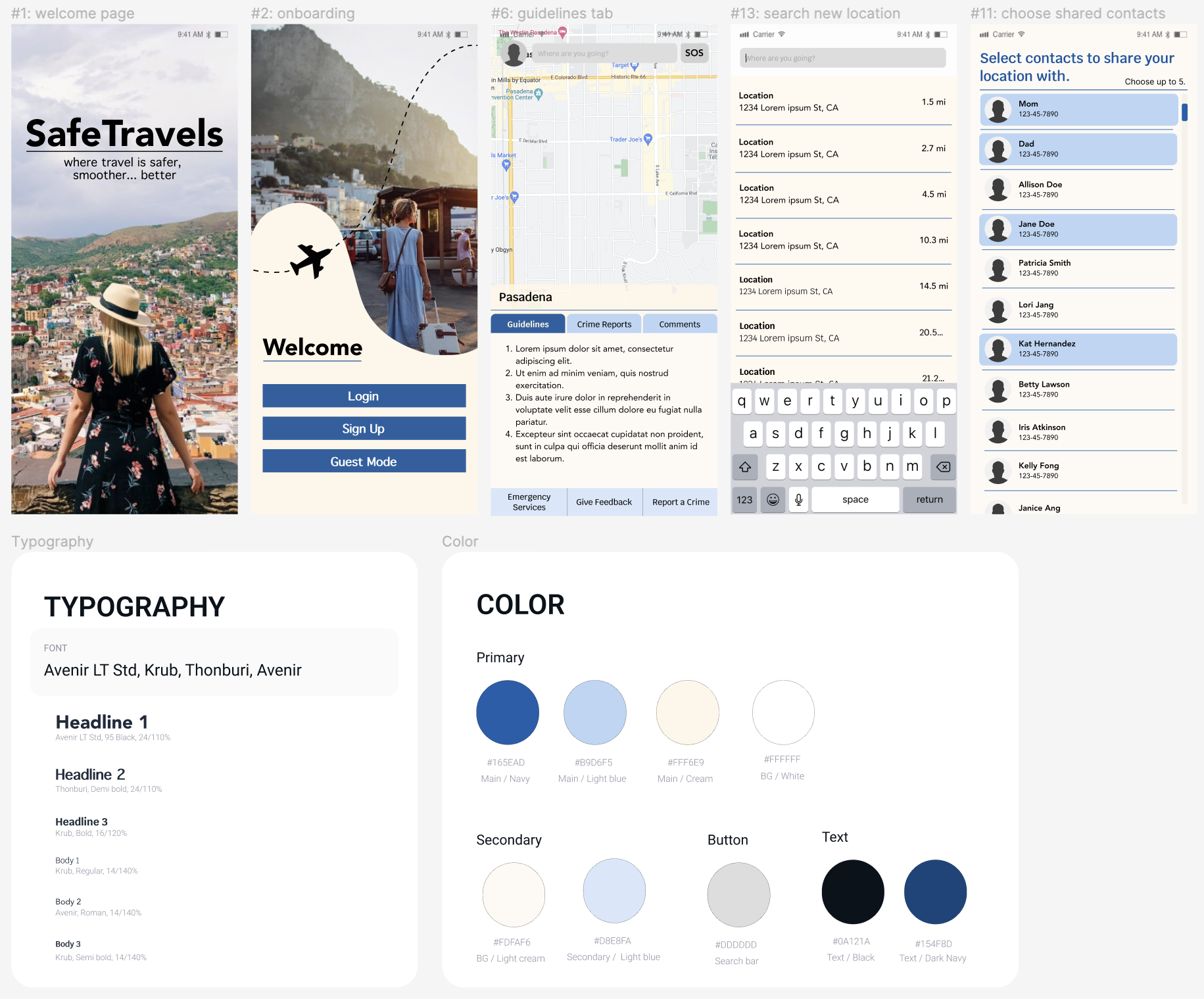
Step 3 — Color and aesthetic directions
Defined color palettes and aesthetic directions before wireframing—testing green-forward and navy-based systems.
-
Green palette -
Navy & brown palette -
Navy palette
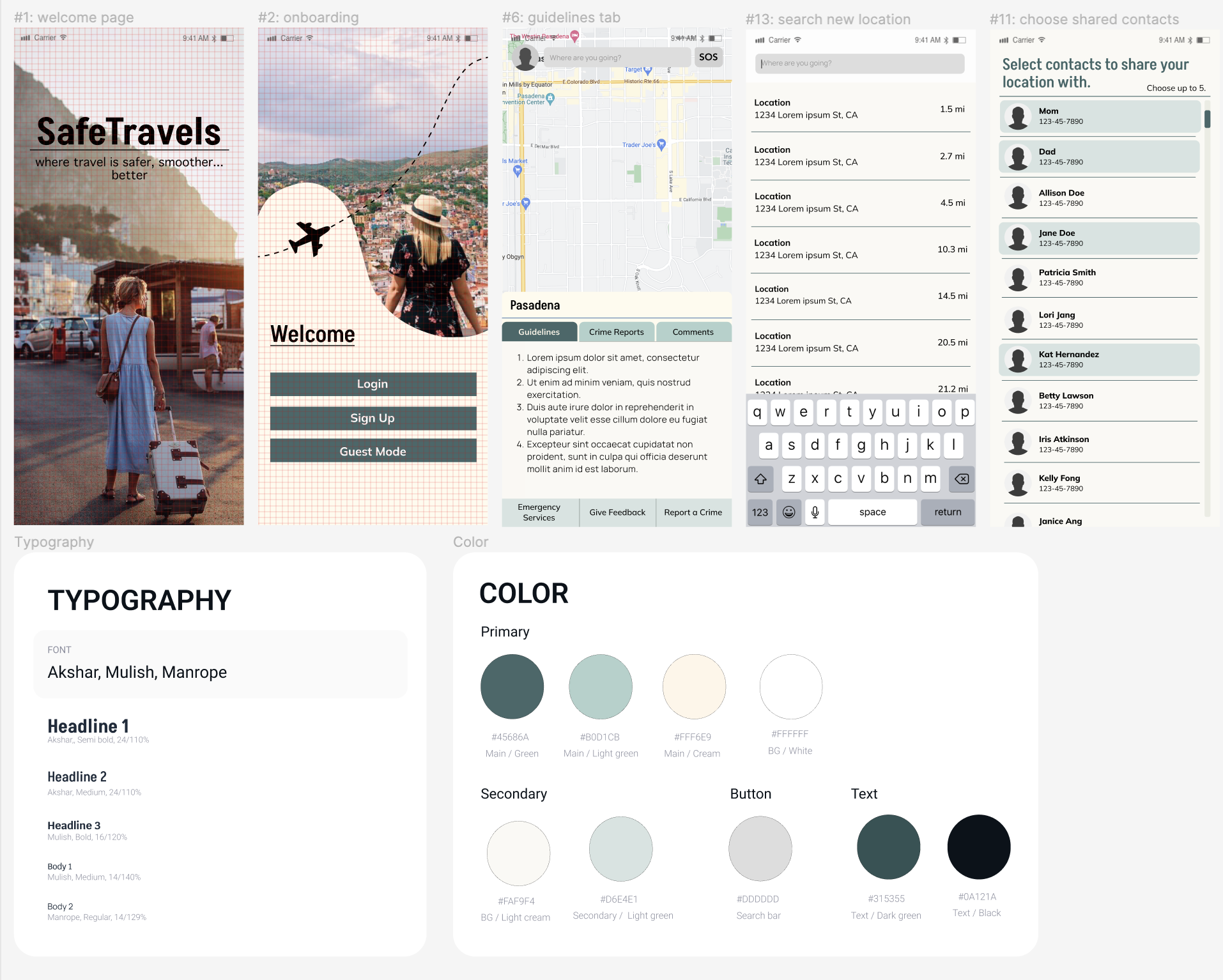
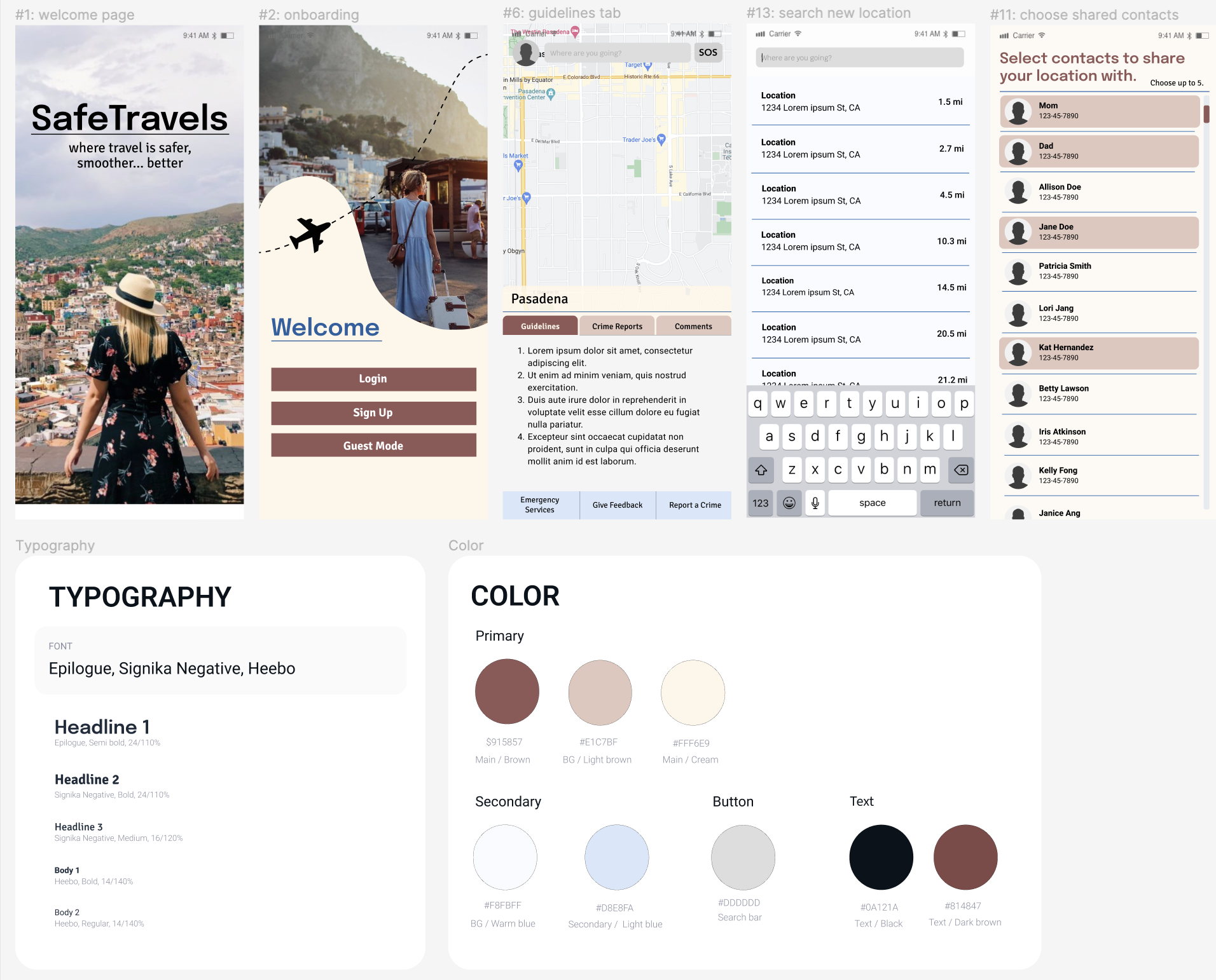
Step 4 — Core flows and screen structure
Outlined core user flows and screen structure across thirteen screens before applying color and visual polish.
Wireframe screens

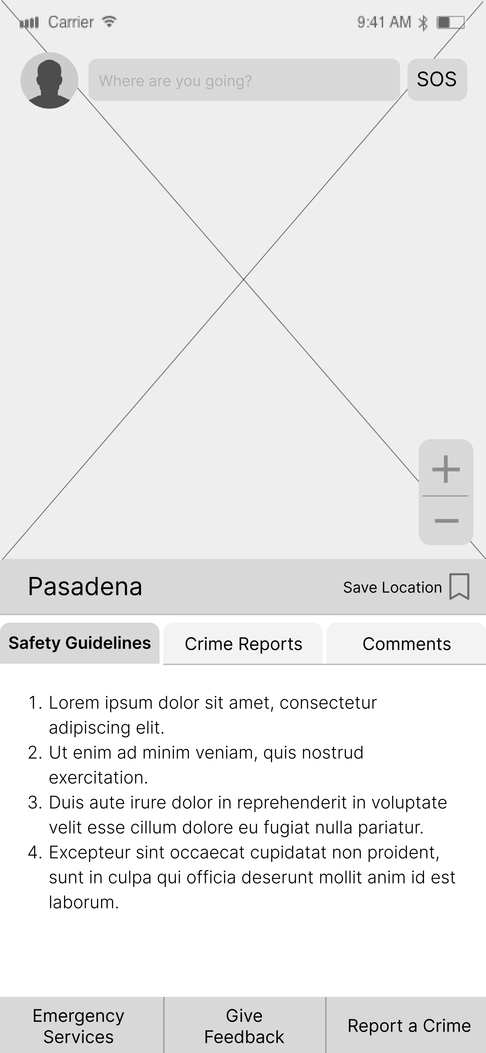
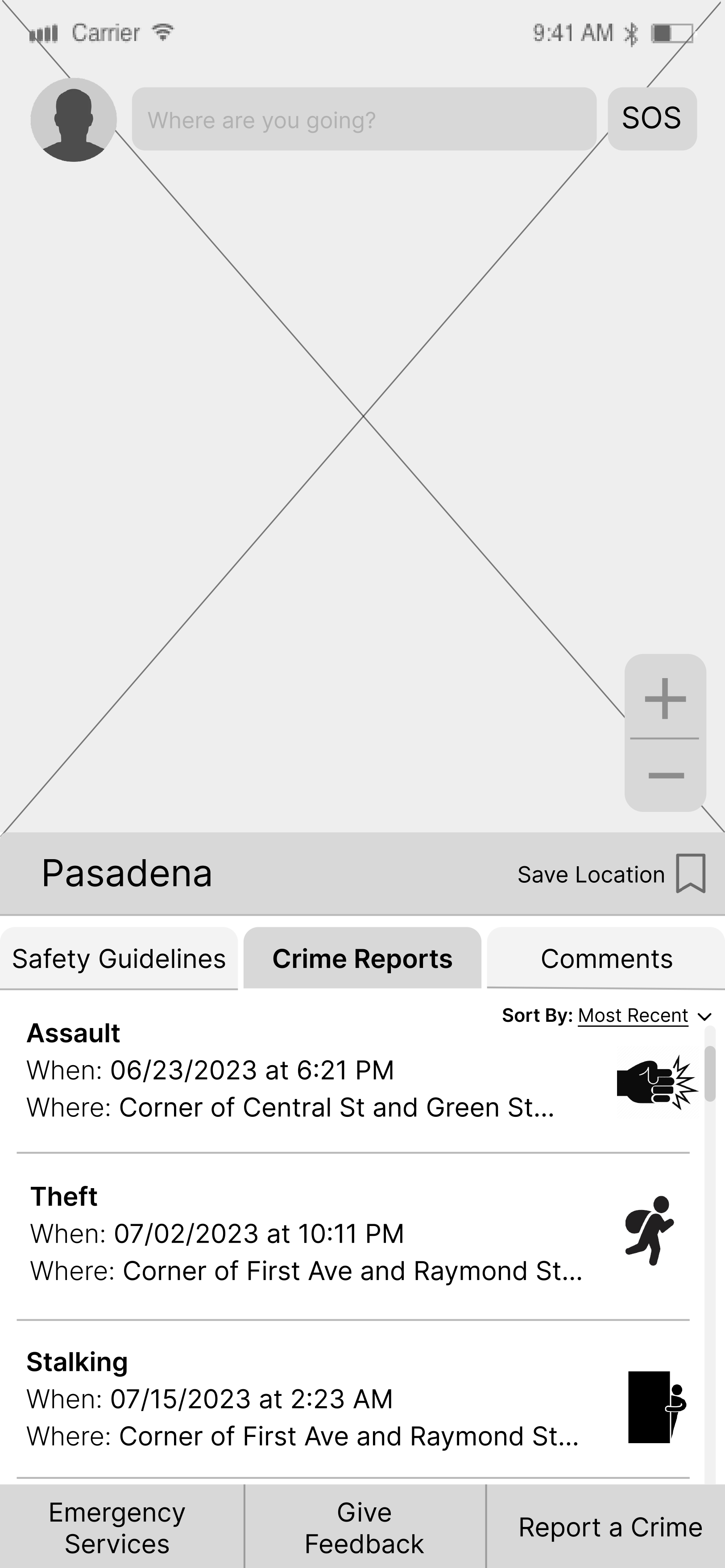
Step 5 — Full-color wireframes
Applied the chosen visual system to full-color, hi-fi screens—including two explorations of crime-report tab spacing before the final layout.
Hi-fi screens